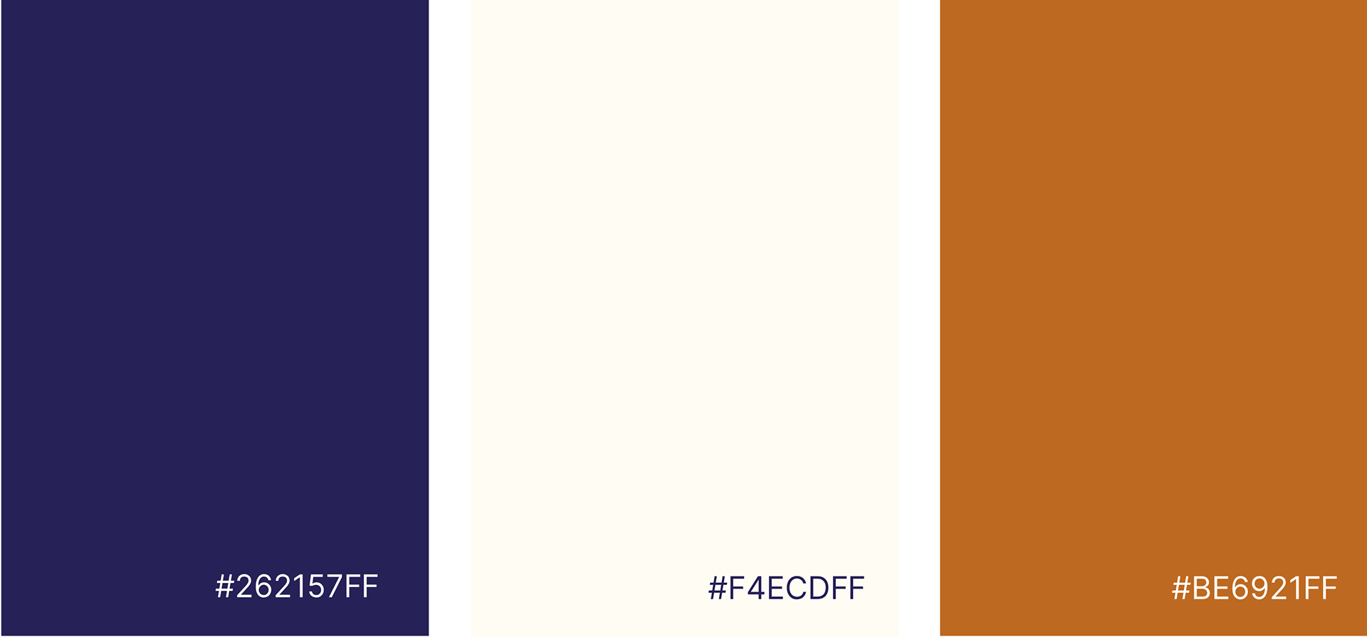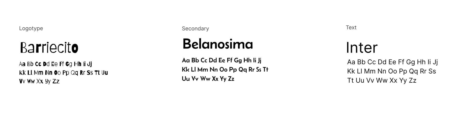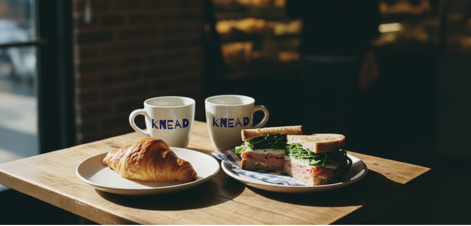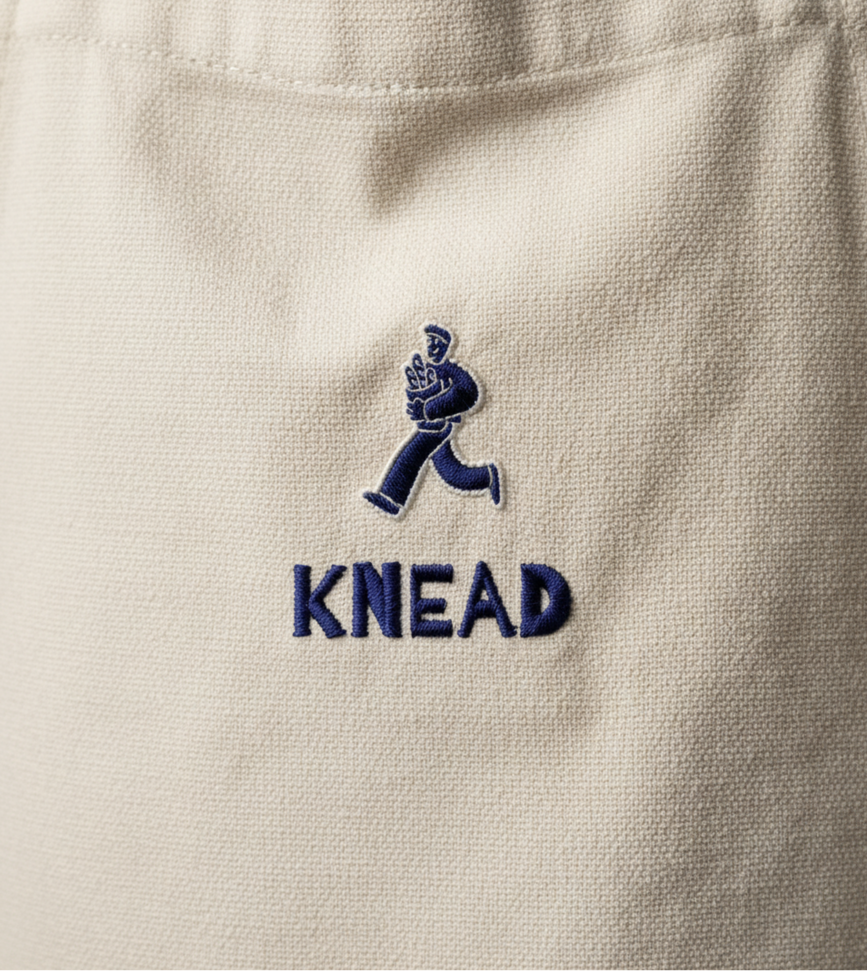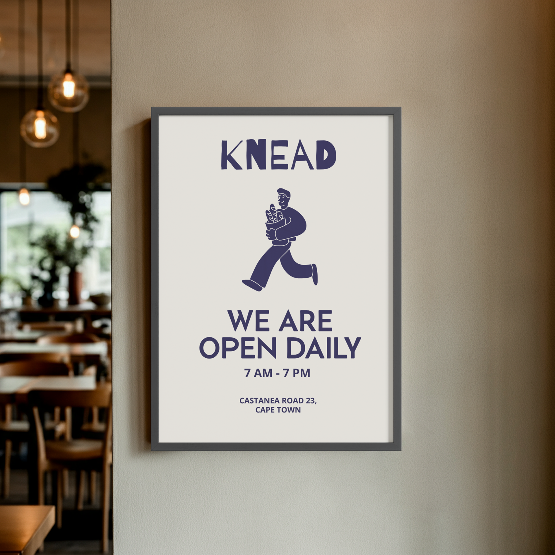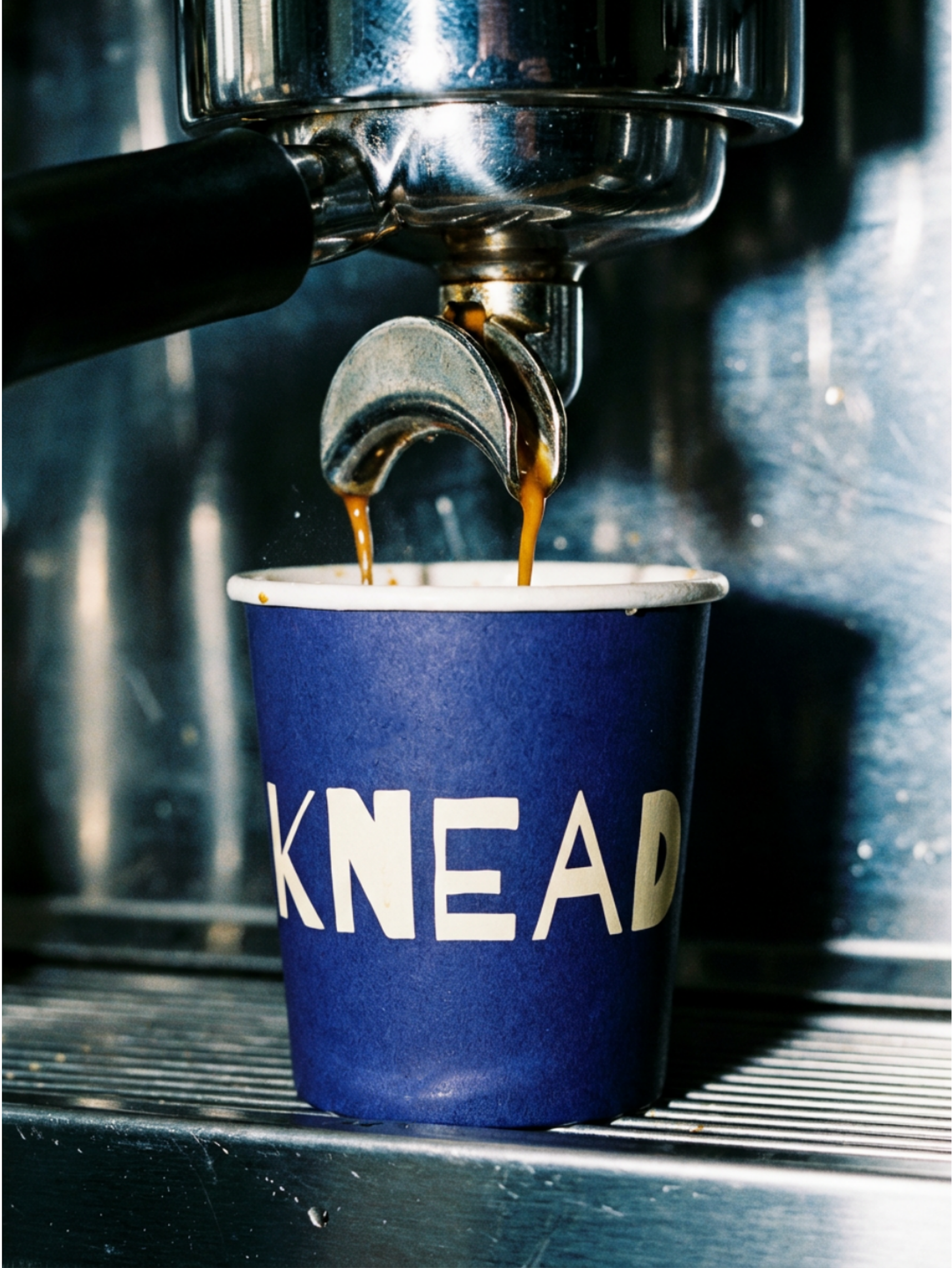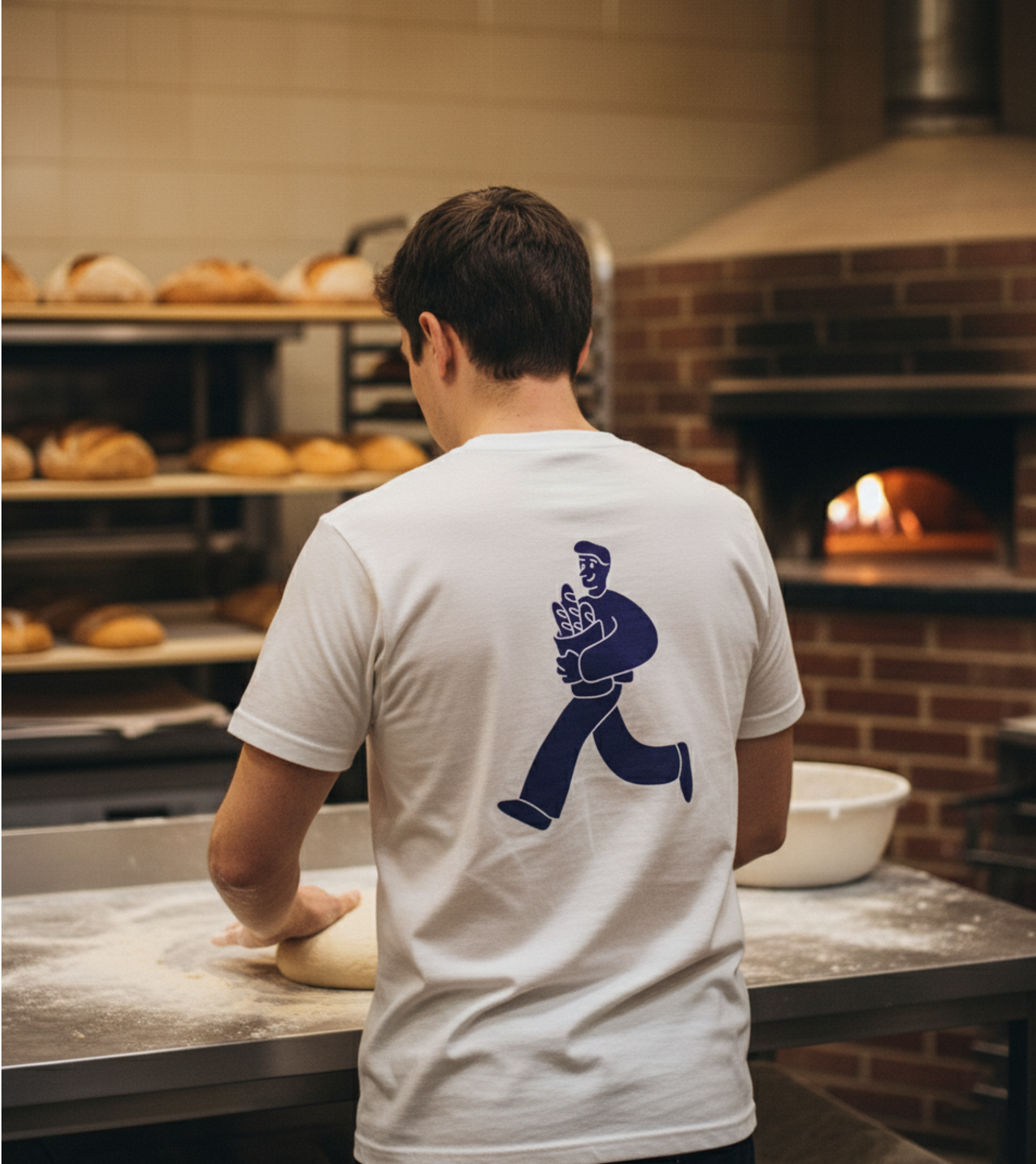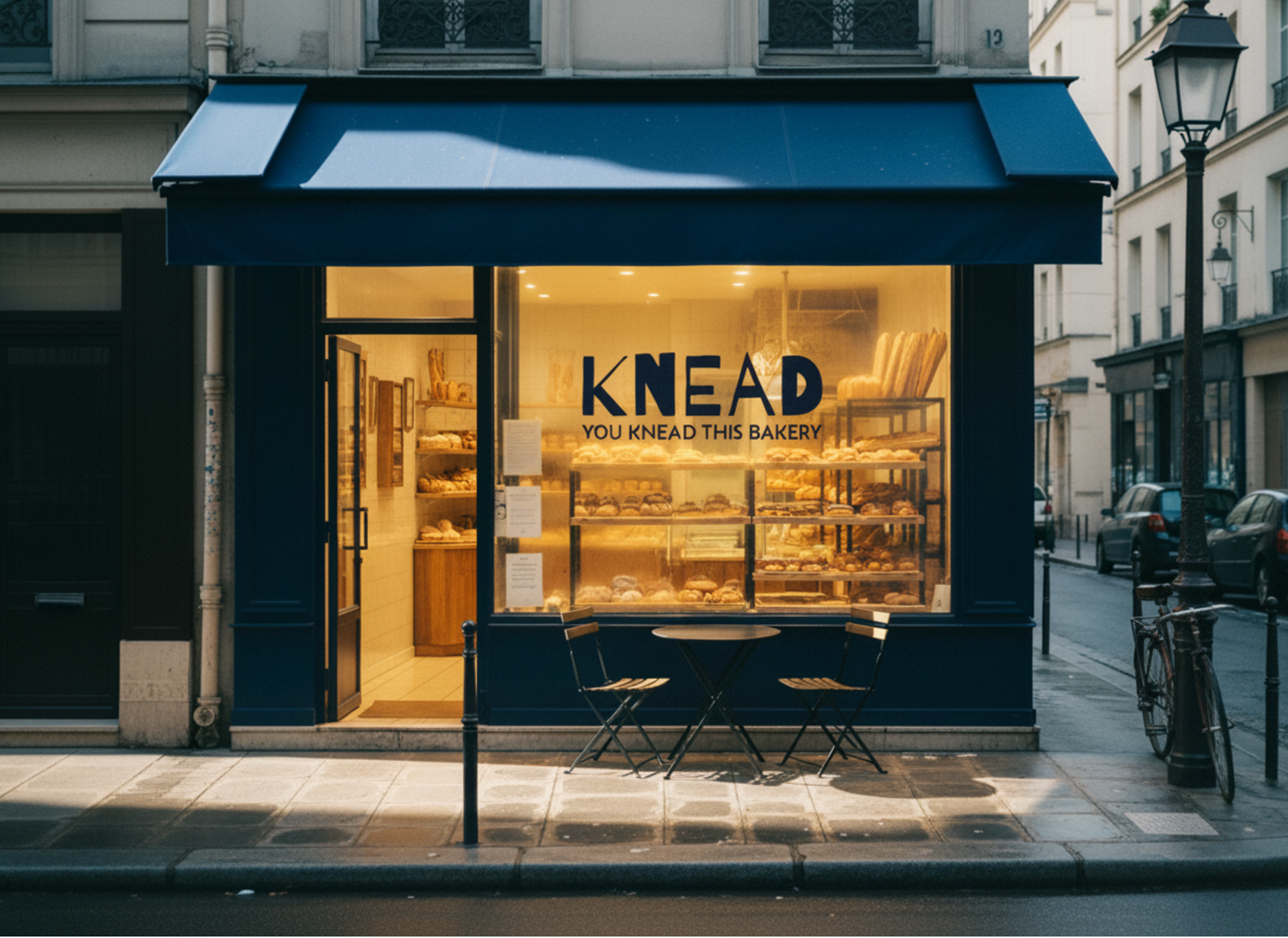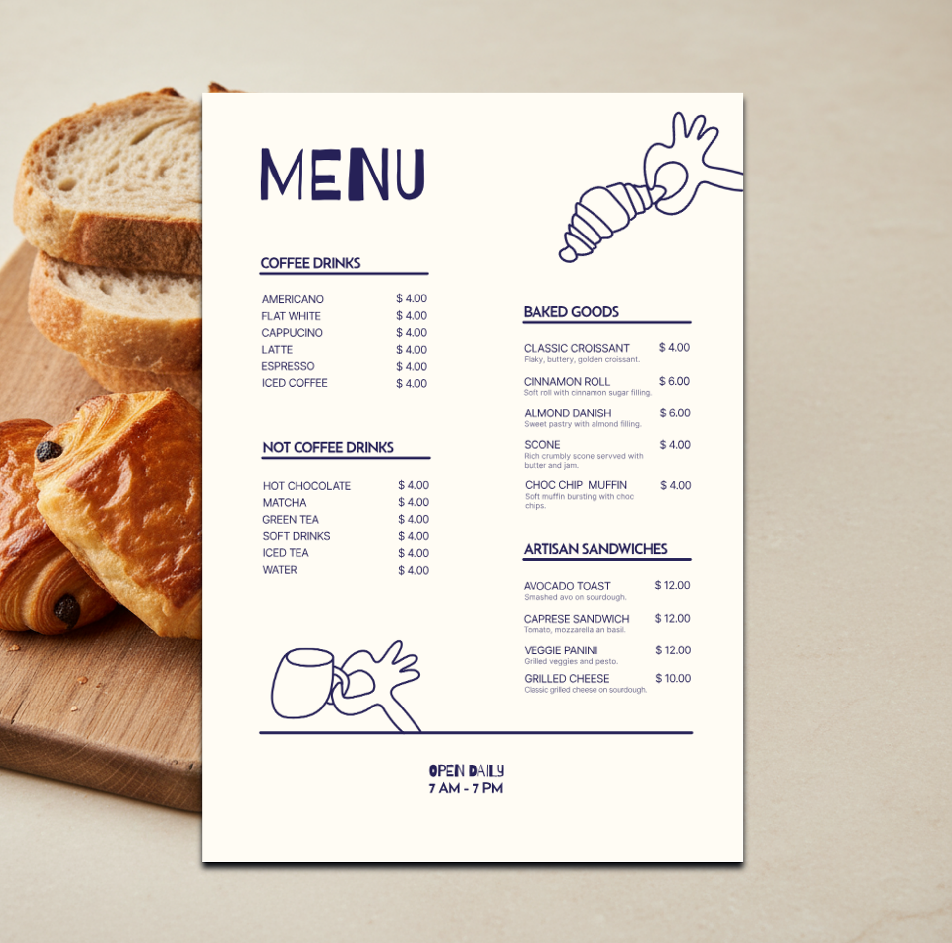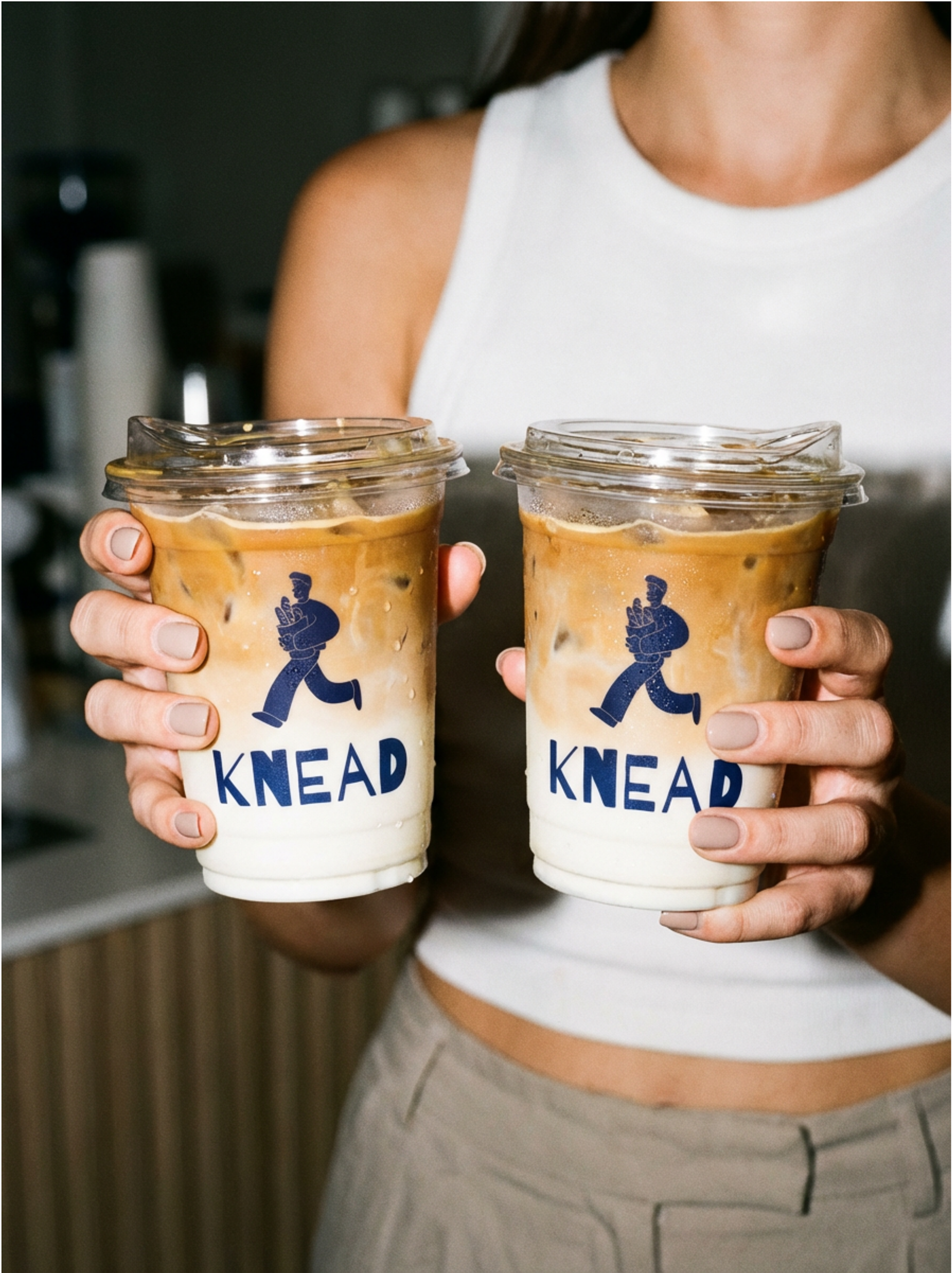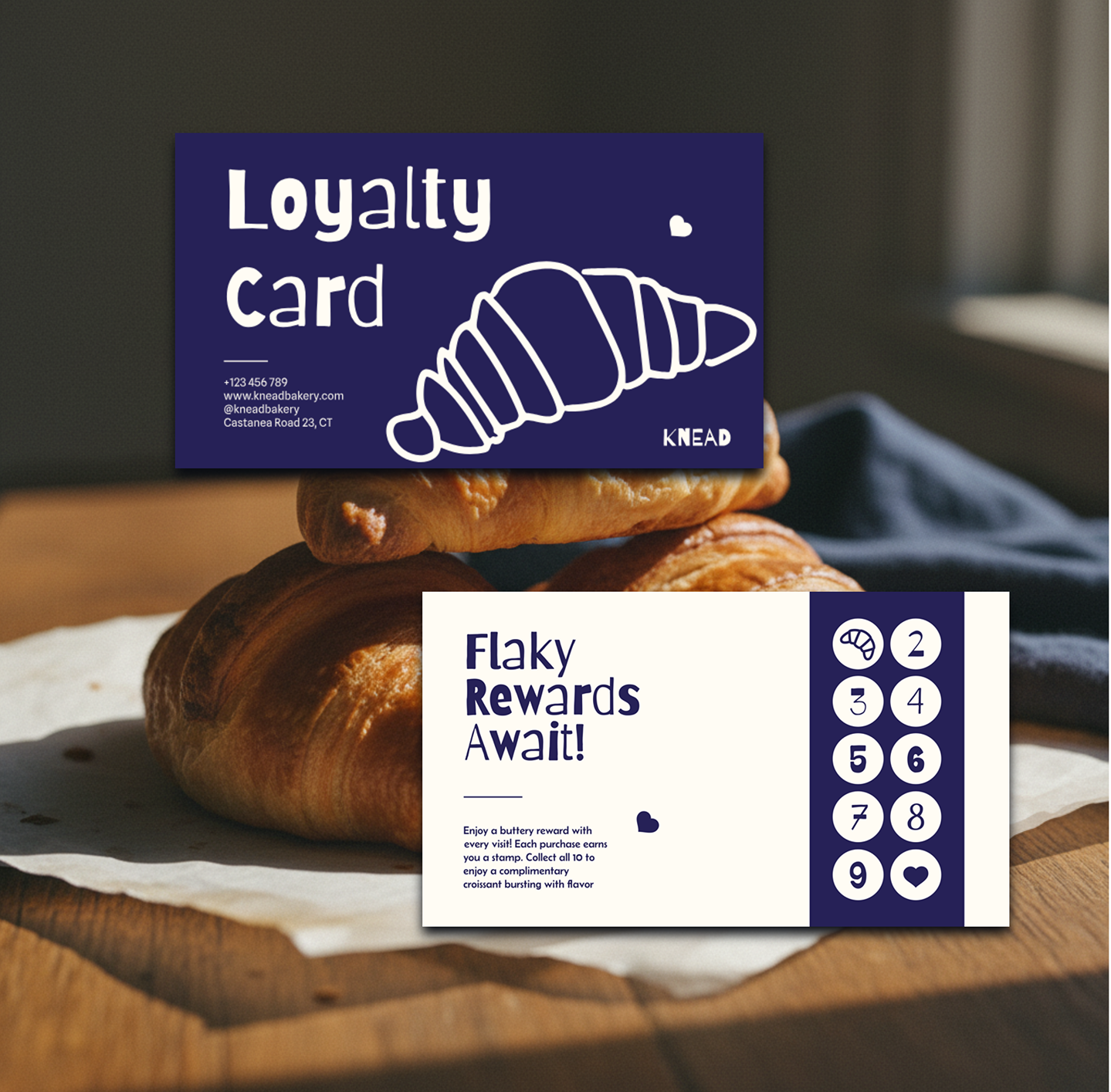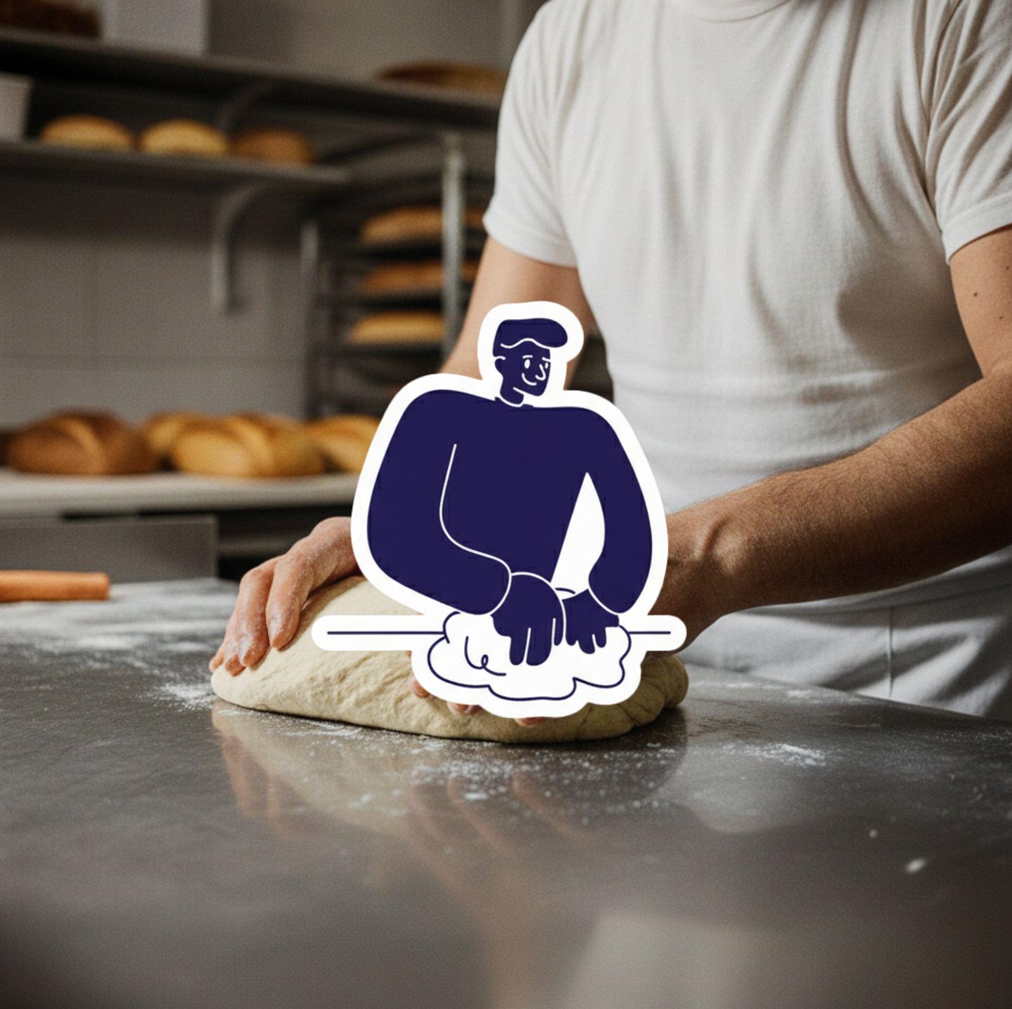
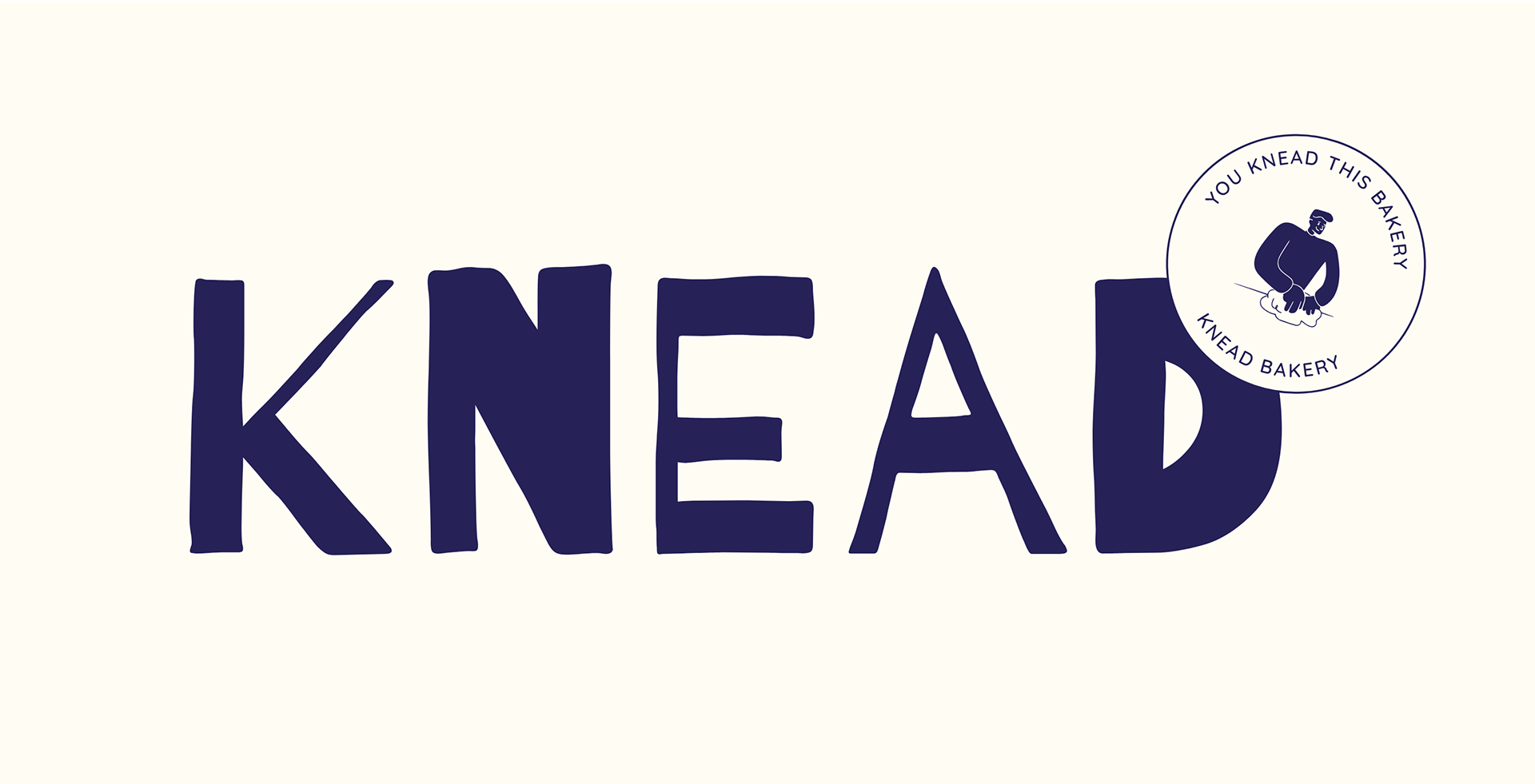
Welcome to KNEAD. Founded on the simple, powerful belief that great bread is an essential joy. KNEAD is an artisanal concept built around time-honoured techniques and a commitment to quality ingredients. Our identity is deliberately crafted to feel both established and effortlessly cool, channelling an authentic, vintage-meets-hip aesthetic. This is visually communicated through a high-impact pairing of deep navy and soft cream, supported by bold, retro typography and a playful, custom mascot. This case study details how the KNEAD brand was meticulously developed - from our distinctive packaging to our environmental graphics - to create a unified, compelling presence that communicates craftsmanship, reliability, and the singular, satisfying experience of holding a perfectly baked loaf.